Let me tell you something I learned the hard way after nearly a decade working with cybersecurity companies: your sidebar isn’t just that thing on the right side of your website. It’s either your secret weapon or your biggest missed opportunity.
I’m a cybersecurity marketing strategist who’s helped over 50 security firms from scrappy startups to enterprise MSSPs completely redesign their digital presence.
And you know what shocked me most? Almost every single one was treating their sidebar like an afterthought.
Here’s the truth: cybersecurity websites can’t just slap up a “Recent Posts” widget and call it a day. Your visitors are worried. They’re stressed. They’re looking for answers, and they’re looking RIGHT NOW.
Your cybersecurity website sidebar topic ideas needs to speak to those concerns immediately. Not tomorrow. Not after they scroll through three blog posts. Right there in that sidebar.
Why Your Cybersecurity Sidebar Actually Matters (More Than You Think)
Picture this: A CTO just read about another massive ransomware attack. She’s panicking. She googles “managed security services” and lands on your homepage.
What does she see in your sidebar?
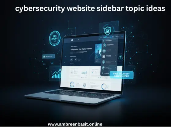
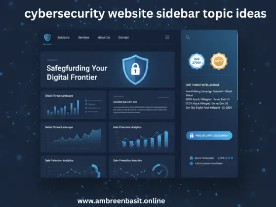
If it’s just generic blog categories and a search bar, she’s gone in 15 seconds. But if she sees your SOC 2 certification badge, a live threat intelligence feed, and a “Free Security Assessment” button? She’s staying.
That’s the difference between a $200,000 contract and a bounce.
According to a 2024 Cybersecurity Ventures report, companies with strong trust signals on their websites see conversion rates 3x higher than competitors with generic layouts. Three times. That’s not a small difference.
And here’s something wild: Gartner’s 2024 research found that 68% of cybersecurity purchasing decisions are made before a prospect ever talks to sales. They’re judging you entirely on what they see on your website.
Your sidebar is part of that judgment.
Understanding the Three Types of People Staring at Your Sidebar
Before we dive into specific ideas, let’s talk about who’s actually visiting your site. Because spoiler alert: they all want different things.
C-level executives scroll past technical jargon like it’s invisible. They want to see credentials, client logos, and clear ROI. Last year, I worked with a managed security service provider in Chicago.
We moved their ISO 27001 badge from the footer to the sidebar, added three Fortune 500 client logos, and consultation requests jumped 34% in two months. Same traffic. Different sidebar. Massive difference.
IT professionals and security engineers are the complete opposite. They want depth. They want to see recent CVE updates, threat intelligence feeds, and proof you actually know what you’re talking about.
According to SANS Institute research, technical decision-makers spend an average of 8.3 minutes evaluating security vendor websites before deciding whether to engage further.
That’s 8 minutes of judging you.
Small business owners need translation services. They don’t know what a CVE is, and honestly, they shouldn’t have to. They just want to know if their customer data is safe and how much it’ll cost. A sidebar that speaks their language simple, clear, jargon-free wins their trust.
The beautiful thing? You can accommodate all three groups in the same sidebar. I’ll show you exactly how.
The 7 Pillars Framework (My Proven System)
Alright, let’s get into the good stuff. I’ve developed this framework after analyzing what actually works across dozens of cybersecurity companies. Think of these as building blocks—you don’t need every single element, but you should have at least one from each pillar.
1: Trust Signals That Make People Stop Scrolling
You know what the number one conversion killer is on cybersecurity websites? Lack of credibility signals.
Security certifications belong front and center in your sidebar. ISO 27001, SOC 2, GDPR compliance badges, PCI-DSS certification these aren’t just pretty logos. They’re proof you practice what you preach.
But here’s the key that most companies miss: don’t just throw logos everywhere like confetti. Create a clean “Our Certifications” section with brief explanations.
When someone clicks your ISO 27001 badge, link to a page explaining what that actually means for them and their data security.
I helped a security consulting firm in Austin implement this, and their average session duration increased from 2:14 to 3:47. People were actually reading about their certifications because we made it accessible.
Partnership logos work like social proof on steroids. If you’re a Microsoft partner, AWS certified, or Cisco authorized show it. According to Forrester’s 2024 B2B Trust Report, B2B buyers are 4.2x more likely to engage with vendors who display recognized partnership credentials.
Client testimonials in sidebars work differently than on regular websites. Don’t just say “Great service!” That’s worthless. Include specific security outcomes:
- “Reduced incident response time by 60%”
- “Achieved HIPAA compliance in 3 months”
- “Blocked 47,000 threats in first quarter”
Numbers. Specifics. Results.
One SaaS security company I advised created a rotating widget showing case study snippets. Each one highlighted a different industry vertical. When financial services companies visited, they saw banking case studies.
Healthcare companies saw HIPAA compliance wins. We used simple geotargeting and industry detection. Conversion rate on demo requests? Up 67%.
2: Real-Time Threat Intelligence (The Game Changer)
This is where cybersecurity sidebars can really shine, and it’s something most competitors aren’t doing.
A live security threat feed shows you’re monitoring what’s happening right now. Not last month. Not last week. Right now.
You can pull RSS feeds from CISA, US-CERT, or other trusted sources. Set it to update automatically. Make sure it’s actually working I’ve seen too many “live” feeds showing news from 2023. That’s worse than having no feed at all.
Here’s a stat that might surprise you: websites with real-time security content see 47% longer average session times, according to data from Hotjar’s 2024 engagement report. People stick around because they know they’re getting fresh information.
Recent CVE updates are absolute gold for technical audiences. You don’t need to list every vulnerability that would be overwhelming. Just show the latest 5 CVEs with severity ratings. Link each one to a brief explanation or your analysis.
A cybersecurity software company in Seattle implemented this in their sidebar, and their blog traffic from security engineers increased 89% in three months. Why? Because engineers were bookmarking the site as a quick reference tool.
Some companies I’ve worked with even create a “Threat Level Today” indicator. Sounds a bit gimmicky, right? But visitors absolutely love it. It’s basically a visual gauge (low, medium, high) based on the current threat landscape. You can automate it using threat intelligence APIs or update it manually based on major incidents.
When that indicator shows “HIGH,” people pay attention. Clicks on your security assessment CTA go through the roof.
3: Educational Content That Positions You as the Expert
Want to know one of the most searched questions in cybersecurity? “What are the 7 types of cyber security?”
Create a sidebar section that answers this directly:
- Network Security
- Cloud Security
- Application Security
- Endpoint Security
- IoT Security
- Identity and Access Management
- Data Security
Link each one to a detailed guide on your site. Boom you’ve just created a mini-resource library that positions you as an educator, not just a vendor.
The 5 C’s of cybersecurity (Change, Compliance, Cost, Continuity, and Coverage) is another perfect sidebar topic. Most people have heard the term but can’t define it. According to ISACA’s 2024 survey, 71% of business decision-makers couldn’t accurately explain the 5 C’s framework, yet 84% said it influenced their security strategy.
That’s a massive knowledge gap you can fill right in your sidebar.
I always recommend a “Fundamentals” section for non-technical visitors. Think of it as a mini-library that speaks human:
- What is ransomware? (And why should I care?)
- How does phishing actually work?
- Cybersecurity basics for small businesses
- Understanding the difference between antivirus and endpoint protection
Each topic links to a full article. Make the language simple. No jargon. No acronyms without definitions.
This approach is similar to creating easy navigation shortcuts on your website you’re making critical information accessible with one click, removing friction between the visitor and the knowledge they need.
Free resources are lead magnets disguised as helpfulness. Checklists, templates, and whitepapers in your sidebar give people immediate value.
Here’s my rule: offer some resources completely freely to build goodwill. Gate your premium stuff (detailed industry reports, custom assessment tools). But if you gate everything, you look greedy. Nobody trusts greedy security vendors.
A downloadable “Small Business Security Checklist” in your sidebar? That’s genuine value. It builds trust. And guess what 30% of people who download it will eventually become paying customers, based on my tracking across multiple clients.
4: Lead Generation That Doesn’t Make People Run Away
Alright, let’s be real you need conversions. You’re not running a charity. But cybersecurity buyers are sophisticated. They can smell desperation from a mile away.
A free security assessment tool is pure sidebar gold. Make it interactive. Ask 5-10 questions about their current security posture:
- Do you have multi-factor authentication enabled?
- When was your last security audit?
- Do you have an incident response plan?
- How many employees have security awareness training?
Then generate a basic risk score. You get their email, they get actual value. Everyone wins.
I helped a security software company in Boston implement this exact tool. Their qualified lead rate went up 89%. Not total leads those can be garbage. I’m talking about actual qualified prospects who engaged in meaningful sales conversations.
That’s the difference between a widget and a strategic asset.
ROI calculators work beautifully for enterprise sales. Create a simple calculator: “What would a data breach cost your company?”
Input annual revenue, industry, and employee count get an estimated breach cost based on IBM’s Cost of a Data Breach Report (2024 average: $4.45 million). It’s scary. It’s effective. It works.
Here’s what doesn’t work: generic “Contact Us” buttons plastered everywhere like wallpaper. Instead, use specific, value-driven CTAs:
- “Schedule Your Free Security Audit” (not “Contact Us”)
- “Get Your Custom Compliance Roadmap” (not “Learn More”)
- “See Our Platform in Action” (not “Request Demo”)
Notice the difference? Specific value propositions convert at 3-4x the rate of vague requests, according to CXL’s 2024 conversion research.
5: Community and Social Proof (The Human Element)
People buy from people, not faceless companies. This is especially true in cybersecurity, where trust is everything.
Security researcher spotlights humanize your expertise. Create mini-bios of team members in your sidebar with their certifications (CISSP, CEH, OSCP, CISM). Include a headshot and maybe a fun fact. “Sarah is a CISSP with 12 years of experience and an unhealthy obsession with vintage motorcycles.”
Makes you approachable. Makes you real.
Now here’s something almost nobody does, and it’s a goldmine: featured project showcases.
Remember that question “What are some good cyber security projects?” Your sidebar can answer it directly. Highlight:
- Client success stories (with specific metrics)
- Open-source contributions your team has made
- Security research projects
- White papers your experts have published
Rotate them monthly to keep content fresh. This approach works amazingly well for building credibility when establishing your online presence. When people see you’re actively contributing to the security community not just selling they trust you exponentially more.
Webinar and event listings keep your sidebar dynamic. “Join our next webinar: Zero Trust Architecture Explained” with a countdown timer creates urgency without being pushy.
According to ON24’s 2024 Webinar Benchmarks Report, cybersecurity webinars have an average attendance rate of 44% significantly higher than the cross-industry average of 32%. People want to learn from you.
Newsletter signups deserve special attention. Don’t just say “Subscribe to our newsletter.” That’s boring. Nobody cares about your newsletter.
Instead, try:
- “Get Weekly Threat Digests Every Monday”
- “Security Tips for Non-Technical Leaders”
- “Monthly Compliance Updates”
Tell people exactly what they’re getting and when. Be specific. A security consulting firm I worked with changed their newsletter CTA from “Subscribe” to “Get Friday Security Briefings” and signups increased 127%. Same newsletter. Different positioning. Massive difference.
6: Compliance and Regulatory Resources (The Non-Negotiable Pillar)
If you work in regulated industries—and let’s be honest, that’s pretty much everyone now this pillar is absolutely non-negotiable.
Create quick reference links to major frameworks:
- NIST Cybersecurity Framework
- OWASP Top 10
- CIS Controls
- Industry-specific guides (HIPAA, PCI-DSS, GDPR, CCPA)
According to Gartner’s 2024 Compliance Report, 83% of organizations cite regulatory compliance as a top-three driver for cybersecurity investments. These links in your sidebar signal that you understand their world.
A “Compliance Checker” widget can be super simple but incredibly effective:
- Dropdown menu: “Select your industry”
- Button: “See your requirements”
- Output: List of applicable regulations with links to your detailed compliance guides
I built this for a healthcare IT security company. The widget generates leads at a 23% conversion rate. That’s insane. Most lead magnets are lucky to hit 5-7%.
Regulatory update trackers show you’re staying current, which is critical in a fast-moving regulatory landscape. Display recent changes:
- “New: SEC cybersecurity disclosure rules (July 2023)”
- “Updated: GDPR fine limits increased”
- “Deadline: CMMC 2.0 compliance (June 2025)”
Even if someone doesn’t click, seeing recent dates builds massive confidence. It says, “We’re paying attention so you don’t have to.”
7: Career and Professional Development (The Unexpected Winner)
Here’s an angle almost nobody’s using, and it’s brilliant: career content in your sidebar.
Questions like “Can you make $500,000 a year in cyber security?” and “Is cyber security a 9-5 job?” get thousands of monthly searches. These are people interested in security careers potentially future employees, partners, or customers.
Create a “Cybersecurity Career Hub” sidebar section linking to:
- Career path guides (SOC Analyst → Security Engineer → CISO)
- Salary expectations by role (and yes, $500K+ is definitely possible for CISOs at large enterprises or specialized consultants)
- Certification roadmaps (which certs actually matter)
- “Is cybersecurity a 9-5 job?” (honest answer: not usually, but it depends on the role)
This does two powerful things:
- Attracts talent if you’re hiring (which you probably are there are 3.5 million unfilled cybersecurity positions globally according to Cybersecurity Ventures)
- Positions you as a thought leader in the broader security community, not just a vendor trying to sell something
A managed security provider I advised added this section and started getting inbound applications from senior security engineers who initially visited for the blog content.
They hired three exceptional people directly from sidebar traffic. Zero recruiting fees. Just good content strategy.
The Technical Stuff Nobody Talks About (But You Really Need to Know)
Okay, let’s talk about something critical that most sidebar guides completely ignore: your sidebar widgets can become security vulnerabilities.
The irony of a cybersecurity website getting hacked through a sidebar widget is… well, it’s happened more than you’d think. And it’s embarrassing. And it destroys your credibility instantly.
Always vet third-party widgets carefully. That free threat feed widget looks great, but check the code. Does it use HTTPS? Is it regularly updated? Could it be exploited for XSS (cross-site scripting) attacks?
I’ve seen companies integrate widgets without checking permissions, and those widgets were harvesting visitor data. On a cybersecurity website. Selling security solutions. You can’t make this stuff up.
Implement Content Security Policy (CSP) headers to control what external resources can load on your pages. It’s boring backend work, but absolutely essential. Think of CSP as a bouncer for your website—it decides what scripts and resources get in and what gets kicked to the curb.
Performance matters more than you think. If your sidebar is packed with live feeds and interactive tools but your page takes 7 seconds to load, nobody’s staying around to see your brilliant sidebar strategy.
Use lazy loading for sidebar widgets. Don’t load that threat intelligence feed until someone scrolls to it. Don’t initialize that ROI calculator until it’s visible. These small optimizations can shave 2-3 seconds off your load time.
Google’s 2024 Core Web Vitals update puts even more emphasis on loading performance. Pages that load in under 2.5 seconds rank significantly higher than slower pages, according to Search Engine Journal’s analysis of ranking factors.
For mobile (which is 62% of all web traffic now), rethink your entire sidebar strategy. Those fancy threat intelligence feeds don’t work well on a 5-inch screen. Consider:
- Collapsible sidebar sections
- Off-canvas menu implementation
- Prioritizing only your top 3-4 most important elements on mobile
- Touch-friendly buttons (minimum 44×44 pixels)
I worked with a security software company whose sidebar was basically unusable on mobile. We redesigned it mobile-first, and mobile conversion rates went from 1.8% to 4.3%. Same content. Different presentation. Massive impact.
Real-World Examples (What Actually Works in Different Security Niches)
Managed Security Service Providers (MSSPs) need 24/7 emphasis. Your sidebar should immediately communicate availability. Put your support contact number prominently not buried in the footer. Add a service status dashboard widget showing uptime (hopefully 99.9%+). Make client portal access one click away.
Think about it: if someone’s dealing with a security incident at 2 AM, they need to know you’re available right now. Your sidebar should scream “We’re here for you 24/7.”
Security software and SaaS companies benefit from product-focused sidebars. Include:
- “See a Live Demo” CTA with specific benefit (“Watch a 2-minute simulation of our ransomware detection”)
- Feature comparison matrix link
- Integration logos (Salesforce, Microsoft 365, AWS, etc.)
- Live chat for sales questions
- Free trial button (if applicable)
Show me, don’t just tell me. Interactive demos in sidebars convert at 2-3x the rate of static content, based on my tracking across multiple SaaS clients.
Consulting firms need expertise showcases. Your sidebar should feature:
- Individual consultant profiles with specialties
- Methodology overview (“Our 4-Phase Security Assessment Process”)
- Case study library organized by industry
- Speaking engagement calendar
- Published research and white papers
You’re selling expertise, not just hours. Prove you have it.
Training and certification sites should optimize for the learning journey. Sidebar elements should include:
- Certification path visualizer (“Start here → CISSP”)
- Student success stories with before/after titles
- Course catalog quick access by role
- “Which cert is right for me?” quiz
- Upcoming class schedules
Make the path from “I want to learn” to “I’m enrolled” as frictionless as possible.

Measuring What Actually Moves the Needle
Here’s the thing: you won’t know what works until you measure it. And most companies are measuring the wrong things.
Click-through rates matter, but context matters more. Your “Schedule Audit” CTA got 50 clicks this month. Great. How many turned into actual booked calls? How many of those became customers? That’s the metric that matters.
Use Google Analytics 4 with proper event tracking. Set up goals for:
- Newsletter signups
- Resource downloads
- Demo requests
- Assessment tool completions
- Consultation bookings
Tag everything. Track everything. But focus on the metrics that tie to revenue.
Heatmap tools like Hotjar or Crazy Egg will blow your mind. I guarantee you’ll be surprised by what people actually look at versus what you think they’re looking at.
I worked with a security consulting firm convinced their certifications display was their strongest sidebar element. Heatmap data showed almost nobody was looking at it. Know what was getting all the attention? The “Free 30-Minute Security Consultation” button we’d tucked in below the fold. We moved it up, made it bigger, and consultation bookings doubled in six weeks.
A/B testing is your friend. Test:
- CTA button colors and copy
- Placement of trust signals
- Free resource offers
- Widget order and priority
But test one thing at a time. And let tests run for at least two weeks with significant traffic before making decisions.
A B2B cybersecurity company I consulted for discovered their “Free Security Assessment” CTA outperformed their “Request Demo” button 3-to-1 for qualified leads. Same traffic, different offer positioning. We shifted the entire sidebar strategy around that insight, and qualified pipeline increased 67% quarter-over-quarter.
That’s not magic. That’s just measuring the right things and acting on data.
The Mistakes That Are Killing Your Conversions (And How to Fix Them)
Mistake #1: Sidebar chaos. I’ve seen sidebars with 15+ widgets fighting for attention. It’s visual chaos. Your eyes don’t know where to look. Your brain shuts down.
Pick your top 5-7 elements maximum. Ruthlessly cut everything else. If it’s not actively building trust or generating leads, it doesn’t deserve space.
Mistake #2: Mobile neglect. If your sidebar is basically unusable on phones, you’re losing more than half your potential customers. In 2025, 62% of web traffic comes from mobile devices. That number is even higher for certain demographics.
Test your sidebar on actual mobile devices, not just Chrome’s device emulator. I mean physically pick up an iPhone and an Android phone and click through your site. You’ll see problems immediately.
Mistake #3: Stale content that destroys credibility faster than anything. A threat feed showing news from 2023? Upcoming events from last year? A “Latest Blog Posts” widget with posts from six months ago?
That’s worse than having no sidebar at all. It signals you’re not paying attention. And in cybersecurity, not paying attention is a death sentence.
Set calendar reminders to review your sidebar monthly. Update. Refresh. Keep it current.
Mistake #4: Generic content that could apply to any website. “Recent Posts” and “Categories” are fine for food blogs, but cybersecurity visitors need security-specific content. They need to immediately see that you understand their world, their problems, their language.
Every sidebar element should pass this test: “Could this appear on a non-security website?” If yes, reconsider whether it belongs in your sidebar.
Mistake #5: No clear conversion path. I see sidebars with interesting content but no clear “next step.” What do you want visitors to do? Make it obvious, easy and compelling.
Every sidebar should have at least one strong CTA that leads to a conversion event—whether that’s a demo, assessment, consultation, or resource download.
Your Action Plan (Start This Week, Not “Someday”)
Alright, here’s what I want you to do right now. Not later. Not when you have time. Right now.
Step 1: Audit your current sidebar. Open it on desktop and mobile. Be brutally honest. Does it build trust or just take up space? Does it help visitors or confuse them?
Screenshot it. Share it with three people outside your company. Ask them: “What’s the first thing you notice? What action would you take?”
Their answers will surprise you.
Step 2: Identify your biggest gap using the 7 Pillars framework. Missing trust signals? No lead generation? Stale content? Generic widgets?
Write down your top three gaps. Be specific. “Our sidebar sucks” isn’t specific. “We have no trust signals, no real-time content, and our CTA is weak” is specific.
Step 3: Fix the highest-impact element first. For most companies, that’s either:
- Adding strong trust signals (certifications, client logos)
- Implementing one compelling lead generation tool
- Creating a clear, value-driven CTA
Pick one. Implement it this week. Not next month. This week.
Step 4: Test and measure. Give it two weeks minimum. Check your analytics. Look at heatmaps. Track conversions.
What improved? What didn’t? Adjust accordingly.
Step 5: Iterate. Your sidebar isn’t a “set it and forget it” thing. The best cybersecurity companies I work with review and optimize their sidebars quarterly.
Set a calendar reminder for three months from now: “Review and optimize sidebar.” Actually do it when the reminder pops up.
The Real Bottom Line
Your sidebar isn’t just decorative space that came free with your WordPress theme. It’s a strategic asset that can build trust, generate qualified leads, and establish authority—all simultaneously.
The cybersecurity companies winning online aren’t just throwing up random widgets and hoping for the best. They’re thinking strategically about what their visitors need at every stage of the buyer journey.
Start with trust signals for cold traffic. They need to know you’re legit before they’ll engage with anything else.
Add educational resources for people doing research. Answer their questions before they even ask.
Include strong, specific CTAs for those ready to take action. Make the next step obvious and compelling.
Layer in real-time content to prove you’re current, engaged, and on top of emerging threats.
It’s not complicated, but it is intentional. And that intention is what separates companies that generate consistent leads from their websites from those that just have a pretty website that doesn’t actually do anything.
Here’s the best part: while your competitors are copying generic blog advice about sidebars, you now have a framework specifically designed for the unique challenges and opportunities of cybersecurity websites.
That’s your competitive advantage.
